
There comes a point during the map making process, after hours of data processing and analysis, where what you've created is either something engaging and creative or meaningless and bland. This alchemy of turning raw data into the meaningful is what excites me most.
The following are more examples of projects I have been working on this year, all 3d renditions of spatial data. I am still trying to push the limits of what can be done with cartography in 3d software but my overall aim is to create interesting and vibrant representations of data visualisations. Any comments and ideas appreciated!


Some basic mapping showing population density and public transport zones, as part of some analysis for the London Real Estate Forum. Good examples of using hexbins to aggregate or disaggregate data. We ended up using the first example for the brochure as it fit in more with the overall aesthetic.


As part of some integrated analysis resulting in assessing the value of UK greenbelt we presented a series of maps for the Academy of Urbanism london conference. The above are some samples of the general style of the map - light base with contrasting bright colours for the analytics gave these maps the ‘pop’ they needed.
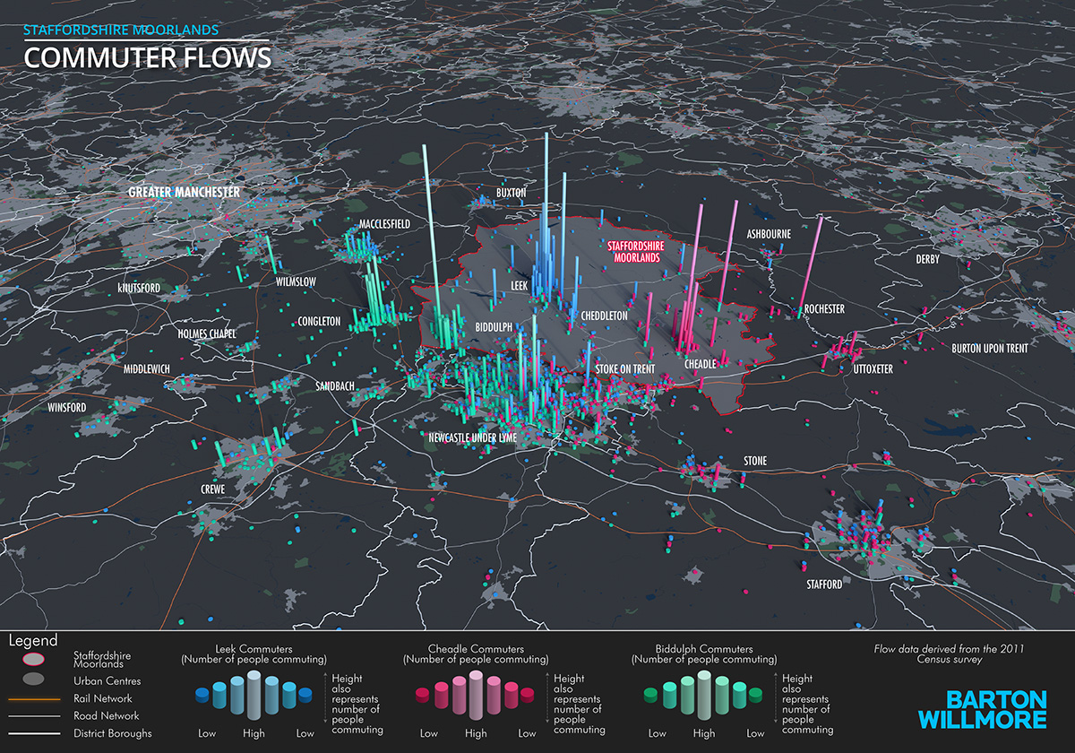


Some more examples of commuter patterns for various urban centres in the UK. The latter two examples were rendered in Cinema 4D using DEM earth which completely streamlines the process of building bases for large urban expanses – it’s awesome! Building terrain into this type of visualisation is always tricky and generally takes a lot longer to model, however the results are great and well worth the extra effort.
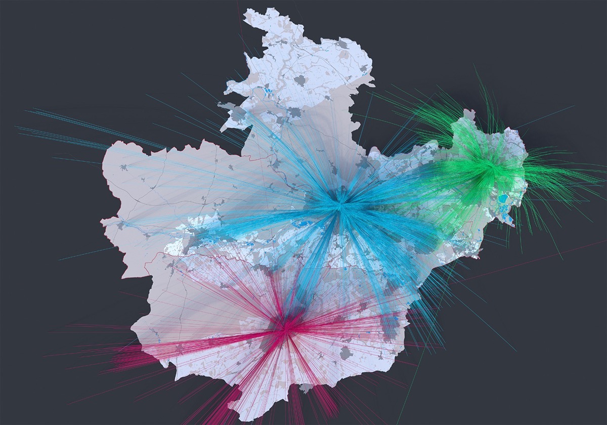
The above is more of a concept visualisation, it hasn’t been finished. For a while now I have been trying to automate and render great arcs in 3d software, it’s took months for me to find a way of bringing spatial flow data into 3d visualisations, still a bit crude but want to do a lot more this kind of mapping in the future.

Bristol University released some really interesting pre-Brexit data analysis on the districts most likely to opt out of the EU which was featured in an LSE blog. I decided to put my own tilt on the data with the above visualisation.


Just a couple of city renders using DEM Earth to highlight topography, definitely going to be adding to these in the near future!


